
8 Graphs you Need To See: August 3, 2022
Nominal versus Real 💸
These two charts from @WSJ offer important reminders to separate nominal and real indicators – especially during high inflation periods. The first graph on US disposable personal income is a familiar one. Current dollars greatly exaggerate real inflation-adjusted dollars.

The second graph illustrates the same phenomenon but applied to retail sales figures. Many analysts point optimistically to increasing retail sales, leaving the impression of strong retail demand. However, with prices exploding, much of the increase is simply due to high inflation. When adjusting for that reality, retail sales are dropping - notably.

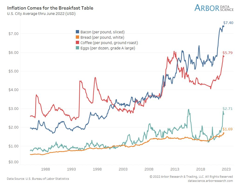
Inflation for breakfast 🍳
Speaking of inflation, the cost of basic breakfast items is spiking. In particular, check out the bacon and coffee spikes, and the recent increase in eggs.
The abortion divide ⚖️
The next graph illustrates political divisions or affective polarization on abortion. In the 1980s, the political parties (individuals identifying with the parties) were nearly in agreement about abortion. However, by the early 1990s, the split began and then widened considerably by 2000. Now, the divide is the largest recorded. Most Democrats believe abortion should be legal under any circumstances while most Republicans disagree. About a third of Independents agree that abortion should be legal under any circumstances.

Consumer savings – and likely consumer debt 💰
A reality check on consumer savings @LendingClub. A total of 15.4% of households have zero savings! More than half of households have less than $5,000 saved. Bloomberg reported that 13% of households spent more than they earned in the past six months.
Historical inflation is forcing many consumers to load up on credit cards to help pay for everyday expenses. In short, poor saving rates, combined with rising prices, mean US consumer borrowing will undoubtedly increase in the months ahead.

Here is another way of looking at consumer savings. Recall, that we hear a lot about how much Americans saved during the pandemic. Notice, in the graph below, the unprecedented spike in US personal saving as a % of disposable income during the pandemic. However, now, personal savings as % of disposable income rests at its lowest point (5.1%) since August 2009. The post-pandemic binge is depleting savings – and quickly.

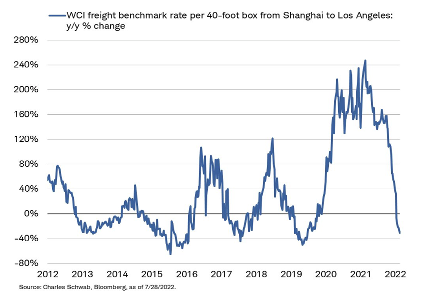
Shipping costs declining! 📉
Here is some positive news about shipping costs. Year over year changes in the cost to ship 40ft containers from Shanghai to Los Angeles dropped to the lowest levels since the start of the pandemic (-32%). While prices are still elevated, Y/Y changes are certainly moving in the right direction.
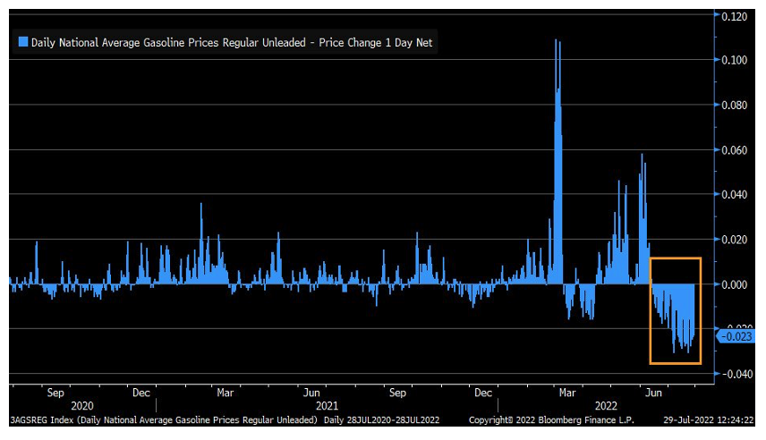
Gas prices dropping! ⛽️
And in another good piece of news, average gasoline prices have not increased daily since mid-June.


Manifest 2024 served as a reminder of the immense potential that lies ahead in the realm of supply chain technology.