
Consider these 5 eye-popping charts
The following 5 charts caught our eye this week. Together, they certainly inform us about important changes in the world. They, in fact, definitively show that change happens - big and dramatic changes.
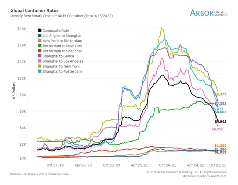
First, the cost of shipping around the world via container (ocean freight rates) continues to collapse. Routes with the most dramatic declines have been those originating from Asia/Europe and ending in the United States. Recall only about a year ago, rates were sky high and produced a lot of pain in the supply chain. Today, they have dropped nearly 80%.
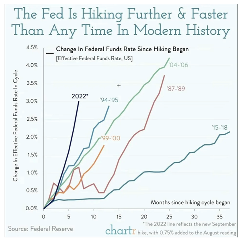
Second, the Federal Reserve, in response to widespread inflation, is hiking interest rates. Yet it is the pace of the hikes that are unprecedented – faster than at any other time in history. This chart compares 2022 to past rate hikes. Given the previous chart (a steep drop in prices), the relevant question now is whether the Fed’s actions are too aggressive.
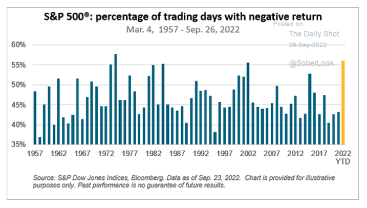
Third, the stock market seems to think the Federal Reserve was too late and too aggressive. This year, so far, the S&P’s percentage of trading days with negative returns topped 55%. The early 1970s was the last time the percentage was higher than today’s marker.
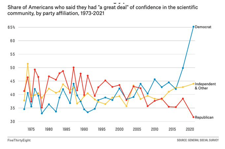
The fourth and fifth charts involve politics. Depicted below is the share of Americans who reported a great deal of confidence in science. Notice that 2016 marks a dramatic rise in confidence among Democrats. Democrats’ confidence in science increased from 43% in 2016 to 65% in 2021! Before 2016, the highest share among Democrats was 46% in 2010.
By contrast, Republicans dropped 3% from 2016 to 2021.
Naturally, the news media focuses on the partisan gap – stressing the low confidence levels exhibited by Republicans. However, this chart makes clear the size of the gap is largely due to Democrats’ sudden embrace of the scientific community. In 2000, for example, Republicans (44%) were more likely than Democrats (42%) and Independents (39%) to express confidence in the scientific community. For most years, Republicans in fact exhibited higher confidence in science than Democrats.
What a turnaround!
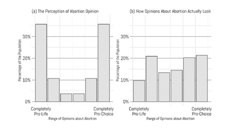
Finally, with all the news coverage about the recent Supreme Court decision on abortion, the last chart offers useful context. The left panel shows Americans’ perception of the distribution of opinion about abortion. In other words, this is what most people think Americans’ opinions are about abortion.
As we are frequently told by the news media, Americans cluster on the extremes – strong pro-life or strong pro-choice. However, the right panel below shows the actual distribution. There is a slight skew in favor of pro-choice, but most people are somewhere in the middle. The public is therefore not polarized on abortion.
So ignore the constant media churn about polarization. The data tells a different story.


Manifest 2024 served as a reminder of the immense potential that lies ahead in the realm of supply chain technology.