
5 Graphs: Job openings, gas prices, & consumer sentiment
NO. 1
A headline chart shows the number of job openings decreased to 11.4 million. The largest decreases were in health care, retail, and food services. The largest increases were in transportation and warehousing.
The chart also shows that job openings remain extraordinarily elevated, producing a historic gap between labor demand (job openings) and worker availability (hires). It seems many Americans are still not participating in the workforce – indeed, participation has been much slower to recover (this is keeping the unemployment rate low).

NO. 2
Recently, gas prices hit another record high, rising to an average of $5.11 per gallon. One year ago, the average price was $3.16 and two years ago the average price was $2.19.

NO. 3
U.S. consumer sentiment continues to spiral down to unprecedented levels.

NO. 4
Air travel is a real headache. This chart shows this past week an average of nearly 2.3 million travelers per day. This is the highest level since the start of the pandemic. However, airlines are struggling to meet the demand. Staffing shortages, especially pilots have led to thousands of delayed and canceled flights. Current airline capacity simply cannot accommodate surging demand. As a result, lot of public frustration. Let’s hope air travel gets better heading into the busy 4th of July holiday.

NO. 5
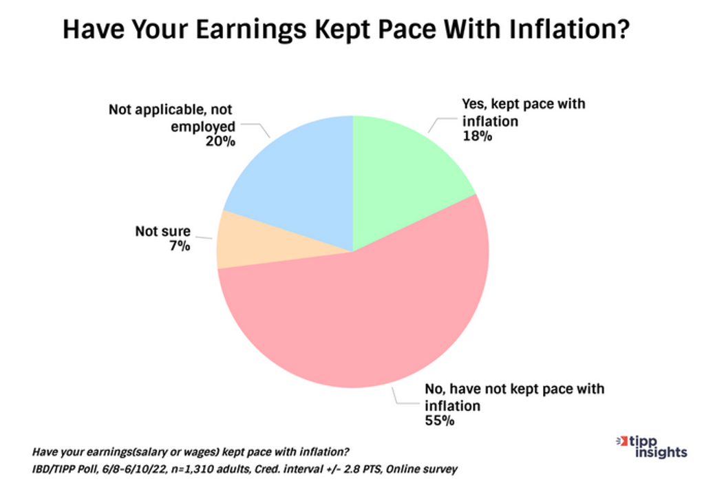
Americans are certainly aware of inflation and what that does to their paychecks. In a recent TIPP poll, 55% said their wages have not kept pace with inflation. Only 18% said their wages had kept pace.


Manifest 2024 served as a reminder of the immense potential that lies ahead in the realm of supply chain technology.