
5 Graphs you Need To See: July 12, 2022
Growing inventories, a new Covid variant, & trajectory of Congress's projected majority - supply chain issues persist regardless of creative pushes to put out the flames. What do the next six months look like for the supply chain from personal, political, and regulatory stands?
NO. 1
Inventories up and up!
Source: WSJ
Big retailers (general merchandisers) are canceling orders with vendors and offering discounts to clear out unwanted goods. This is happening while consumers pull back on purchases of goods once in high demand. The result is that levels of inventories relative to sales at the largest retailers are substantially above pre-pandemic levels.

NO. 3
Power in Congress: Democrats vs. Republicans
Source: Five Thirty Eight
The House of Representatives likely flips this fall but will the Senate?


NO. 2
The rise of BA.5
The New Variant
This surge may add to the imbalances across certain employment sectors and renew efforts to stay at home and remote work.
NO. 4
Back to work
Back-to-work measures show people are still working remotely. Office participation is not even close to pre-pandemic levels. Texas cities have come back , comparatively, while San Francisco lags far behind.

Here’s another take on this phenomenon. In-person activities like NBA games, dining out, and air travel is approaching pre-pandemic levels – approaching ‘normal’. But, not back to work…. not even close to normal.

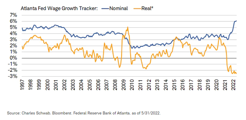
NO. 5
Wages pressured by inflation
The divergence between real and nominal is striking. The four-decade high in inflation is taking its toll. Real wages are way down!


Manifest 2024 served as a reminder of the immense potential that lies ahead in the realm of supply chain technology.